Inlägg

The grid component (continued)

Bild
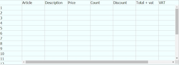
One week later and the grid is getting finished. At least to some extent. It got quite good actually, simple to use but a bit awkward to configure. At least until i figure out a better way to do it. As i mentioned in the last post i was considering adding functions to it, at the time i only had the picklist. Now there are a few calculation functions as well. All functions are assigned on columns and not on single cells. The newly added functions make the grid very suitable for creating invoices. This is the case that the following images will demonstrate. Lets start by removing all rows. This will put the grid in an auto-growing mode. As soon as something is typed in the row another row will be added at the bottom. I had to create a new type of document for this demonstration, fortunately that is very easy. I created a form with 3 inputs: article id, description and price, then i used the data import wizard to import a number of articles using that newly created form. Now we have 9 dif

The data grid component

Bild
The data grid component The other day i started working on a grid component for the forms. I have thought long and hard about how to solve some of the problems of unforeseen data. I have added array capabilities for fields if that is required, but it is not a very flexible solution. The filtering assistant of the data view is an example of this functionality. Then i realized that a grid component could solve many of the issues so i started working on one. The image below illustrates a grid component in the visual designer, very early in the development: Like everything else the idea is the possibility to create a fully working grid without writing any code. There will be limitations in functionality, but it is doable. The image below shows the grid component in the visual designer after some more development Now we are starting to get somewhere, but a fully fletched grid needs a lot of functionality that will take time to develop. One such functionality is to link the system's pick

The cache component

The cache component Many of the features of this platform is enabled by the local cache component. It is the component that handles most of the communication with the server. It does currently not handle all communications as it lacks the features for specific requests. When data is requested, the component first search it's local store before contacting the server. Depending on the nature of the request, it may decide that server contact is not necessary and returns data from the local store only. If some data is found locally it may ask the server for more before responding to the request. This method keeps server load as low as possible while also making the system respond quicker to requests. When a record is updated on the server a short message is dispatched to all it's clients, if a client has this record in it's store it will be flagged as outdated, though it will only be refreshed when requested. This way the cache component knows which data is up to date. When the

The data view component

Bild
The data view component Data views are the second main component of this tool. Like most things it is simple to create and use but also very powerful. Let me show you. Just put the view on the form and select a view in the 'Source view' dropdown and you are set. This is a view showing some would-be customers This data source only have three records and all are shown since we have not filtered the view on anything. Sorting and filtering is done in the columns. Each column is a text box in which you can type something to filter results on. Ranges are possible. Sorting is done by clicking the arrows button The X button is a function button for how the data should be presented in the graph mode. Yes, the data view can also be shown as a graph as shown on the image below. The image above shows the same data view in which data has been grouped by name and the number of occurrances of each name is counted on the phone column. This is just one example of how the graphs work. There are

The form component

Bild
The form component Forms are one of two main components of the tool. It allows the entry of any type of data. Forms are created in a built-in visual designer, my intention was to make it WYSIWYG but i'm not quite there yet. HTML is a bit difficult to get right. Below is a screenshot of the editor with the 'New incident' form loaded. In the editor you can add most standard HTML elements such as text boxes, list boxes and buttons. You can also add components that are built for this tool only, such as panels, data views and tree views. This is where the tools shines: You can add complex components not native to HTML with little or no code requirements. Many methods are pre-built, for example the form submit. You can add this method to a button click by simply setting it's submit property to true. The same thing can be accomplished by code if desired. There are scripting capabilities for many types of events.  Below is a screenshot of the form in the editor when executed on

Introduction

Introduction This first entry is written approximately 19 months after i started my project. At first i had no thoughts of blogging about this. But as time passed and the project grew more and more sophisticated, i came up with the  the idea of blogging about the development. I had to look at the timestamps of the files to find out when i started the development, and it appears as i started around December 15 2019. Since December of 2019 i have been working on something that initially was intended to be a flexible incident management tool. This has taken a lot of time and thanks to the COVID 19 outbreak i had lots of time on my hands. I was only working between 20 and 50% for 14 months, but my children were at daycare full time so i had a lot of free time for the development. As i mentioned above it started out as an incident management tool, but after a few months i realized that it could be so much more. Almost everything in the tool was user defined already so why limit ourselves to